In a competitive mobile phone market, handset makers and network operators constantly struggle to find additional competitive edge and differentiating elements to persuade consumers to select their brand instead of a competitor’s.
Of course, many factors influence the end customer purchase decision. It can be price, features, brand name, perceived ease-of-use and robustness, marketing exposure, ratings and recommendations, industrial design of the physical device etc.
Needless to say, a vital part of a device’s success is also related to the user interface (UI), which will directly influence the purchase decisions and satisfaction during use, and indirectly influence pricing and media exposure in, for instance, network operator campaigns.
This article covers key components and approaches when building successful mobile device UIs, today and in the years ahead. Even though the focus is mainly mobile phones, most of the underlying mechanisms remain the same for any embedded system with a display and GUI (i.e. automotive, consumer electronics etc.), although at different maturity levels.
Strategic asset
When talking about user interfaces for mobiles, it is impossible not to mention the iPhone. With the introduction of this iconic device, the perception of what a UI in a mobile phone should look like was brought to a whole new level in terms of graphical richness, responsiveness and innovative input mechanisms.
More importantly, UI strategies were suddenly on every executive agenda, and the need for a solid and differentiated UI is no longer questioned. Despite this, very few manufacturers have managed to deliver phones with the same level of compelling UI experiences.
Why has this proven to be very difficult, and what are the missing pieces needed to reach an iPhone UI experience and even go beyond?
Before answering this question, we need to get back to what a UI and user experience (UX) refer to. In many contexts, UX is used as a synonym to UI. There are, however, fundamental differences between the two expressions.
A UI of a device normally refers to any graphical, auditory, sensory or textual information the applications use to communicate with the end user, in combination with the control sequences the end user in turn employs to control the device (e.g. keyboard input, selections with finger or stylus on a touchscreen, voice commands, gestures etc.).
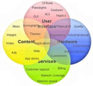
UX, on the other hand, is a term used to describe a complex ecosystem (Figure 1 above) with many stakeholders and actors. UX spans across all aspects of the interactions between a user and a product or service, including experiences of purchasing, unpacking, setting up the product, quality of any collateral material, network coverage, customer support, available applications and services etc.
In other words, it covers the whole range of services and components, while the UI is one essential part, since this is what users face everyday when interacting with the mobile device.
It is clear that the success of the iPhone is due to the entire user experience and not just the user interface. Nevertheless, the UI obviously plays a vital role and essentially two key components are involved—excellent underlying technology (software and hardware), as well as an extremely focused vision and design process executed with perfection.
Thus, for any UI to be successful, the vision and the work process (i.e. the concept design and the visual design/direction) must be there, and the technology must facilitate the implementation of such a vision.
The UI vision is the undisputed law as a fundamental part of the device story telling and brand positioning. Everything else is subordinate. Get these parts right, and it is guaranteed you will be able to create an iconic device (at least in terms of UI). Ok, that makes sense. But what is then required by the technology? What components need to be there, and how does it work?
UI architecture
During the past 10 years, we have seen an impressive evolution within the mobile UI space. At the time of the introduction of full graphical displays and later, color screens, UI in mobile was still in its infancy.
UI was very much a last-minute cosmetic final layer in products driven by technology where feature was king. The UI design was heavily constrained by software and hardware being tightly coupled together (typical phones from that time included Nokia 7110, Motorola V50, Ericsson T28 etc.).
After this first phase, device UIs gradually started to become a tangible asset, and products were increasingly driven with UI as an important tool for differentiation.
Over time, new factors started to have influence over the UI, like network operators, and content and service providers. Today third party developers also add value to the device user experience with the mobile phone essentially transforming to a generic service platform.
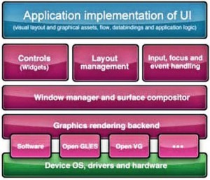
To support these growing needs from different stakeholders, a modern user interface system constitutes a complex piece of software. It is often referred to as a UI Toolkit or UI Framework, and it provides re-usable software components and developer tools to significantly ease the creation of user interfaces. Figure 2 belowshows a simplified overview of how this type of software typically is structured (client side). Normally coupled with this are PC-based tools to simplify the actual authoring of the UI.
Rendering back-end
A vital component in all UI systems is the graphics rendering backend. This takes care of low level drawing of primitives such as images, geometry, text glyphs etc. The rendering backend can be entirely implemented in software, interfacing with a framebuffer. However, in high-end devices, it normally also takes advantage of hardware accelerated graphics functionality provided by the underlying SoC.
The most common APIs used in mobile for this are the Khronos standard APIs, such as OpenGL|ES 1.x or 2.0 or sometimes OpenVG. OpenGL|ES supports acceleration of both 2D and 3D, graphics (with full 3D meshes), and provides full, raster graphics based, control over individual pixels (at a finite resolution).
OpenVG, on the other hand, is targeted for vector graphics with less control over each pixel, but with essentially infinite resolution. It supports scaling, rotations and other transforms as well as animation of shapes. It also has advantages in terms of smaller silicon die area, and more efficient representation of data at higher resolutions.
The key drivers for hardware acceleration of graphics have mainly been the display evolution with higher resolutions like WVGA/720p/1080p, in combination with requirement for multiple screen support.
Other drivers are requirements around responsiveness and quality (e.g. with the introduction of touch input), 3D UIs and media acceleration. It is, however, not without concerns that these technologies are integrated— increased BOM, power consumption and complexity (system architecture, organization and competence, to name a few).
Some hardware systems may provide simplified support for hardware acceleration, e.g. only alpha blending (transparency) and accelerated blitting process without support for 3D. This is common in industries such as automotive and consumer electronics.
Window manager
Coupled to the graphics-rendering backend is usually a window manager. The window manager enables different parts of the UI components to share the physical display real estate and hides this complexity from the applications (e.g. how one window is partly obscured by another or when a popup dialog appears on top, etc.).
Rendering graphics and dealing with window management with solid real-time performance are processing- and memory-intensive activities. On top of this, the increasing demand for UIs with animated properties, transitions and effects has made the traditional window manager approach where the applications draw directly to the display obsolete.
To solve this problem, a compositor-based approach to window management is needed (Figure 3 below). In short, the compositor approach enables elements of the UI to be treated as layers, which are then composed (i.e. combined) together to produce a final image.
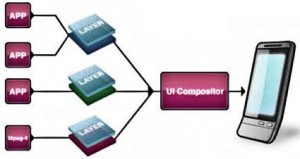 The compositor approach enables elements of the UI to be treated as layers, which are then composed together to produce a final image
The layers may be the target for different application drawing, resulting in the final compositing step being decoupled from application drawing, and in doing this, the bottlenecks are removed.
The compositor can easily animate window positions, sizes and add effects such as transparency and drop-shadow with high performance— enabling a much greater UI experience.
Components (such as images, anti-aliased text and geometry primitives), effects and external sources such as video elements can also be combined in real-time.
To further improve performance, things like intelligent overdraw minimization typically can be added in the compositor implementation (for software rendering). The composition functionality is an ideal area for hardware acceleration, and lately even standard APIs have been created for this purpose (Khronos OpenWF).
Controls, widgets
A user interface system will typically offer a set of reusable, static and dynamic UI building blocks such as labels, lists, input fields, icons, buttons, scroll bars and dialogs. This is commonly referred to as widgets or controls.
Each control is usually configurable by setting certain properties, e.g. to define size and position on the screen. Some properties need to be “localized,” i.e. adapted to a certain language system. Most significant are the text strings shown in the UI, which changes depending on the consumer’s native language.
To support localization (sometimes also referred to as internationalization or I18N), a resource management system is normally implemented, which also supports things like theme control of the user interface.
Minding the layout
The most straightforward way to place controls inside windows is to use absolute positioning (x, y) and size (width, height) for each. Although this gives detailed control, it is very tedious to do manually and not very flexible. Instead, most systems will include layout management.
A layout manager will e.g. automatically align margins and sizes, provide list-, grid- or docking layouts, handle screen resizing layouting (e.g. portrait to landscape) and so on. Advanced layout managers even support layouts in 3D.
All that is needed is to tell it which components to layout and what criteria to meet, and then the layout manager will automatically set positions and sizes for each component.
Manipulation
For the user to interact with the UI, there must be support for either direct or indirect manipulation (or sometimes both). Historically, indirect input via hard keys has been the most common method. But in the past couple of years, a clear trend is moving more and more for direct input using touchscreens.
For indirect input scenarios, you typically do not want every component to react to every user input at all times. Instead, there will usually be some method to route and change input focus.
This controls which of the windows with interactive, dynamic, controls receives user inputs. In the case of direct manipulation (with touchscreens), the user interacts with the elements on the screen using a stylus or finger, and the need for focus management is not needed in the same way.
Implementation of direct manipulation is, however, not without problems and has caused significant headaches for many handset makers that rely on legacy UI frameworks. The problem lies in the fact that with direct manipulation any lag between input and visual feedback will instantly be noticed.
With indirect manipulation, a frame rate around 20fps is acceptable, while direct manipulation needs at least 30-40fps to be considered a solid experience. As a part of the input system, a set of events are defined, and typically modeled, using call-backs.
This could be, for example, events when the user selects a list item in a scrollable list, a button is pressed etc. that would cause a state change in the underlying application logic. The UI system may also trigger autonomous events, e.g. when an animation has reached its end.
Design patterns
A common pitfall when developing a UI for an application is to mix data access code, business logic code and presentation code in one big mess. There are several severe drawbacks with this.
The applications become difficult to maintain due to interdependencies; it is difficult to reuse code across applications and platforms; adding or changing new presentation formats is time consuming etc.
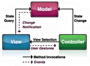 The MVC architectural software design pattern was described to solve problems by decoupling presentation and user interaction, data access and business logic.
The Model-View-Controller (MVC) pattern was first described in 1979 as an architectural software design pattern to solve these problems by decoupling presentation and user interaction, data access and business logic. Figure 4 above outlines the different parts in MVC, which includes:
Model: is the representation of the data on which the application operates. When the model changes its state, it will notify its associated views. The data is typically stored in a persistent repository.
View. The view is responsible for the visual presentation and rendering of the model data into suitable set of user interface elements.
Multiple different views can co-exist for a single model for different purposes. A basic example is a list that in one view maybe is a simple vertical scrolling list, whereas in another view it is a carousel 3D list, still with the same underlying model.
Controller.The controller receives user input events (sometimes via the view) and then initiates actions by making calls and state changes on different objects in the model.
Declarative UI approach
Another mechanism that has proven to be very efficient in modern UI development is the declarative UI approach (as opposed to a programmatic approach).
A declarative UI normally refers to a setup where the visual presentation (the view in MVC) is controlled by a human readable language (e.g. XML-based) parsed at runtime and executed upon.
An example of a declarative UI language is Microsoft XAML. In some capable systems, even the UI flow is controlled by declarative statements, enabling even more flexibility (for instance, very rapid changes and “re-flow” of the UI to accommodate a new form factor). This is not an absolute must-have, but proves very valuable in many cases.
A number of challenges can be addressed by applying the declarative approach. It gives a clearer distinction between project and team roles to enabling parallel workflows; it helps reduce cycle time and development cost; it better supports fast and late customization; it enables more efficient rapid prototyping; it reduces testing time and so on.
Bleeding edge UIs
Whoever thought the evolution of mobile device UIs was leveling off made a great mistake. Going forward, the requirements for UIs will only accelerate, and we see a number of clear trends for 2010 and beyond that will impact UI implementation and design. Here are examples:
(1) Devices are getting packed with new types of sensors (both input and output) that will bring a whole range of new scenarios and interaction paradigms to be explored;
(2) UIs with multiple display feeds (>2) and interaction surfaces (both for the device itself, but also when the device connects to other CE devices like TV sets etc.);
(3) The introduction of picoprojectors in phones with projected UIs controlled by mid-air hand gestures via camera input;
(4) The AR hype, i.e. UIs with components and interaction superimposed on the camera feed, integrating with the background scenario;
(5) 3D UIs on standard displays, and also implemented as “real” 3D i.e. with auto stereoscopic displays.
These are only a few use cases, but to support these and more, we need to get back to the two most important factors for a successful UI strategy:
(1) The UI vision is the law. Concept design and the visual design/direction shall guide.
(2) The UI technology must be capable enough to facilitate the implementation of such a UI vision and work process.
Now from the UI technology perspective, we can identify three key components that must be provided by the UI framework (besides the core functionality such as layouting, widgets etc.):
Component #1: A compositor-driven UI architecture (must be there from the beginning);
Component #2: Support for MVC-driven development (with UI client architecture and tools); and,
Component #3: A mechanism that facilitates a declarative UI approach (typically via XML controlled visuals and flow).
An important fourth factor, which is not a part of the UI Framework as such, but plays a vital role in the overall experience, is also how efficiently the underlying system can provide data to the UI, i.e. the databindings (the model part in MVC).
A bottleneck due to a slow file system or too limited system bus bandwidth will inevitably ruin the whole UI experience.
Successfully applying these key elements will build a solid foundation not only for the UIs of today, but also help to prepare for future challenges and opportunities in UI.
It will provide the ability to design/redesign the UI before, during and after launch. It will support the difficult decision of what platform to bet on, by simplifying the porting of UIs across platforms and operating systems.
Together with a carefully crafted graphics rendering backend, it will also allow you to scale between form factors and hardware capabilities. It will allow you to push the visual limits and graphical richness of mobile UIs.
It may seem pretty simple, but still many manufacturers struggle to get all the pieces right. Then along came Android.
Android: iPhone contender
Last year, the number of devices based on Android has exploded, and this is often put forward as the only true contender to the iPhone. Indeed, from a technology perspective Android is a very capable and well-crafted platform for next-generation mobile devices.
It has a strong architecture and system design with low entry barrier/learning curve, every application is a Web 2.0 citizen and the Dalvik RTE (and partly XMLbased UI framework).
However, it is still not really optimized to solve the long-term UI challenge. As an example, it is still fundamentally a programmatic approach to UI with the code riddled with design decisions (i.e. it is not design-driven).
Another example is the “all applications created equal” concept, which is good from a programmer’s point of view, but instead leaves difficult decisions to the end user.
Furthermore, the fact that the RTE is Dalvik/Java-based has drawbacks for anyone who has a multiplatform strategy.
Currently, Android is not supporting the latest generation of hardware capabilities (like OpenGL|ES 2.0 with 3D), which is a drawback from a UI perspective, although according to Google, gradually this will be exposed through clair and subsequent releases at some point.
Nevertheless, as it is today, Android indeed provides a good base to start from, but then the handset manufacturer or operator need to invest their way out from vanilla and create their own branded feeling to the UI.
Typically, this is done by proprietary additional UI functionality like we see in the HTC Sense UI, which to date is the most successful alternative Android UI.
The trend, however, is clear and essentially all manufacturers are following HTC’s path (Motorola Blur UI, Sony Ericsson X10 UI, etc.). Time will tell if this is a sustainable strategy and provides enough differentiation
Ref: Fredrik Ademar is chief technology officer at TAT AB
